Bogesunds Rör
Bogesunds Rör
—
Client
Bogesunds Rör is an authorized plumbing company, based in rural Sweden it has served the local community since 1982.
It's A small full-service business, that started as a joint venture and over time have scaled down on the owner side. For more than a decade, it has been runed as a family operation. Their main objective is to deliver high quality service, always at a fair price!
Problem
There have been several different issues over the years, they all helped shaped a solid partnership for design and strategy services. Starting of in a small manner, the initial issue came about in 2001. The logotype used up until this point was hand drawn and did not exist in digital versions.
Digitalizing the original logotype was merely a quick fix, something that became more apparent when developing marketing materials for various platforms and formats. The old logotype was visually challenging to use, with a horizontally heavy and long company name. Made out of a custom cut font that also included a licensing symbol and full of details that made it hard to use, especially in small sizes.
The profile colour also kept bringing problems when most of the advertisement was print based and ran through local newspapers, the high amount of magenta kept bleeding out and more than often extinguished the dark blue feel of the brand.
Solution
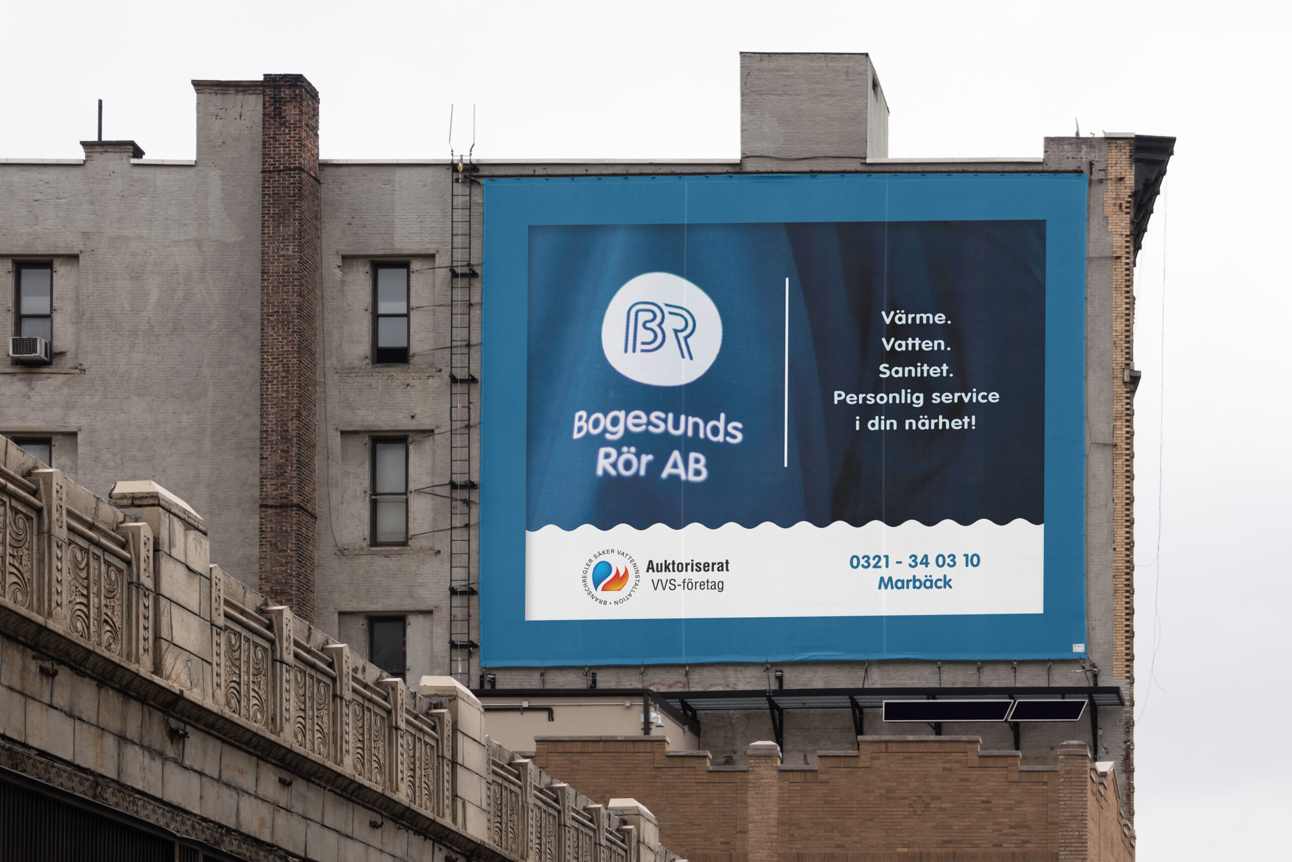
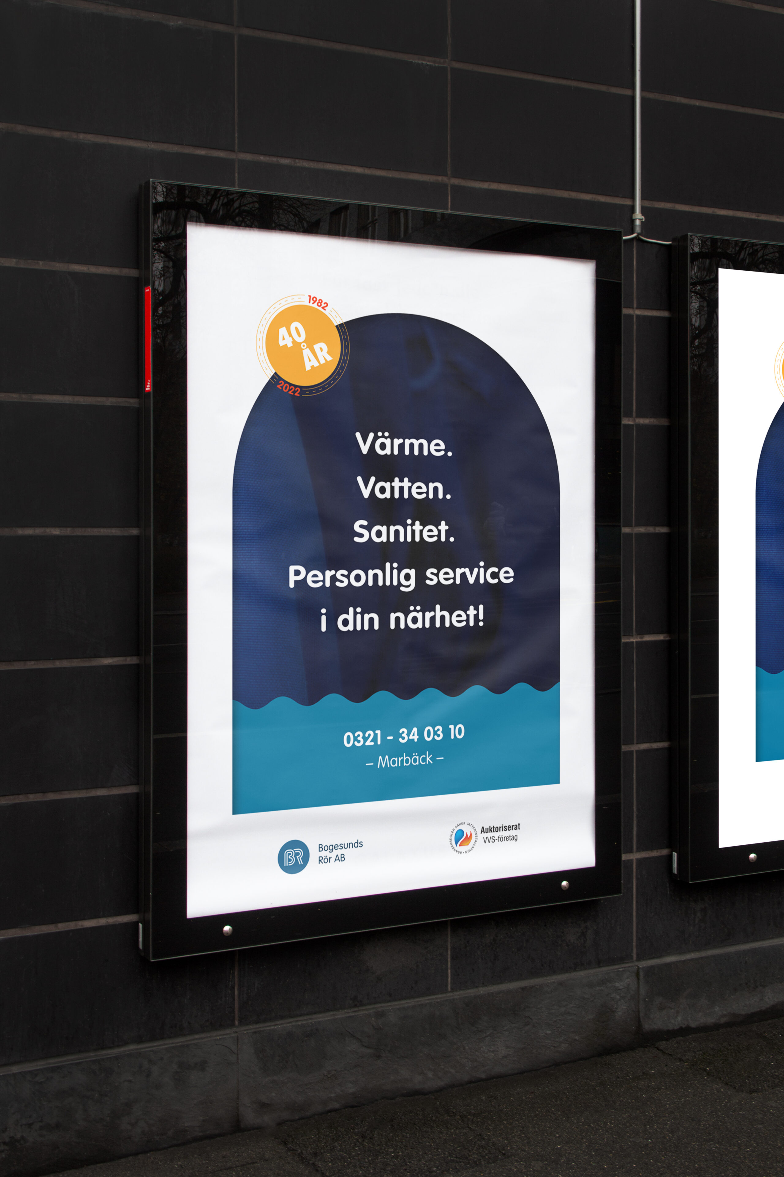
Since this company have been around for 40+ years now, the name and logotype is well recognized in the geographical area of operation. They have also made good on their promise and objective, built a solid clientele for generations in the local community. They are well know for high expertise and solid work, and therefore deliver on service with great authority and matching prices. I also helped develop a slogan based on these insights, something simple that has been used in advertisement over the last decade:
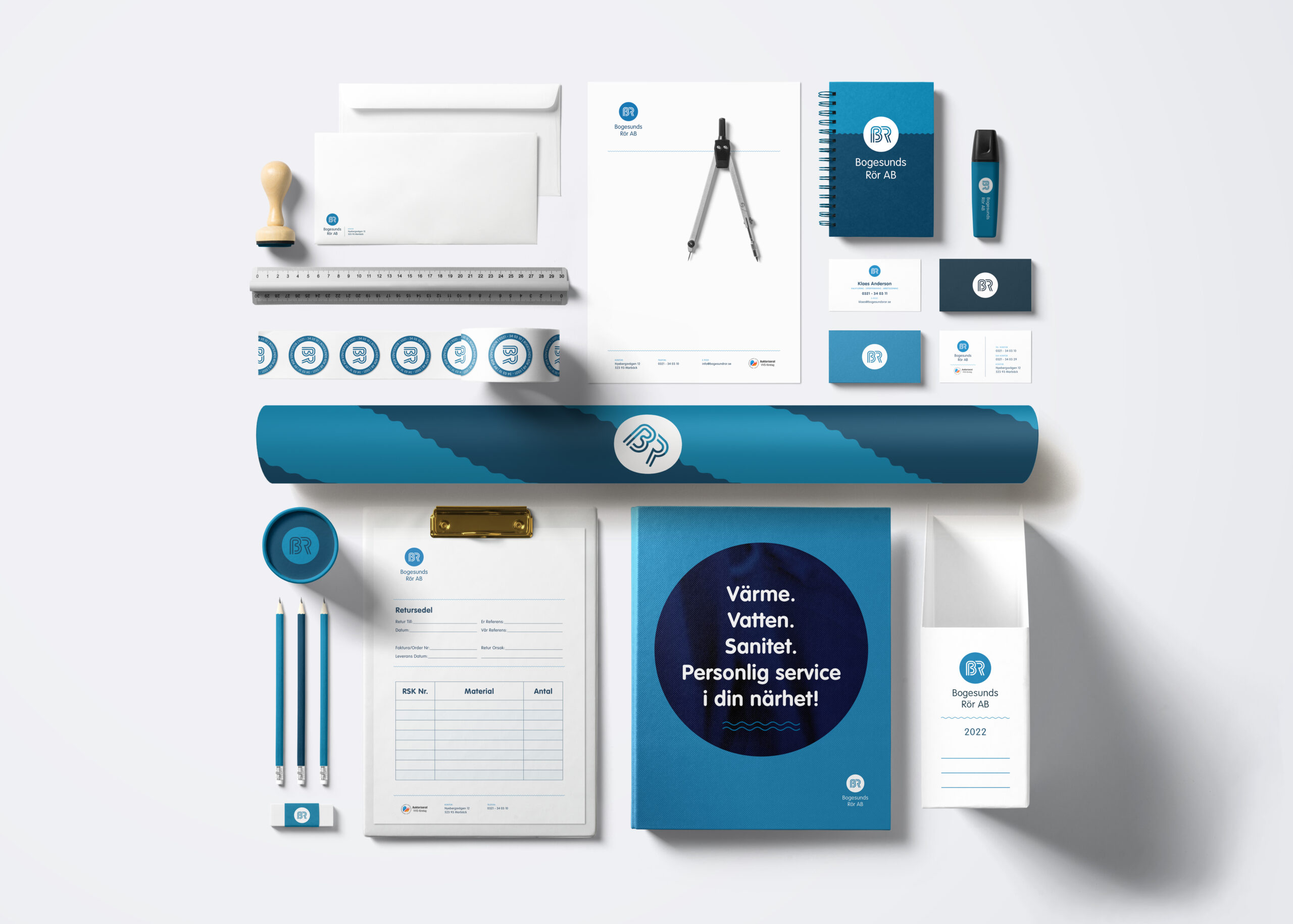
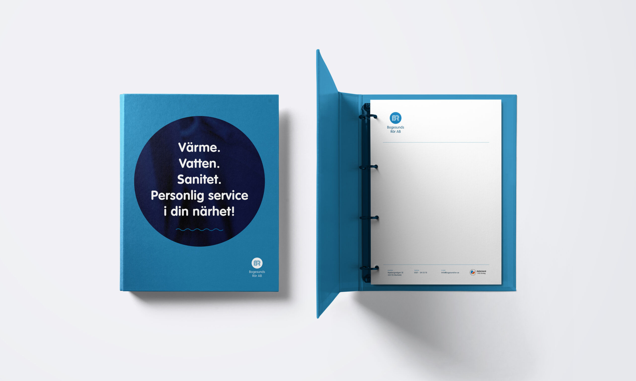
“Värme. Vatten. Sanitet. Personlig service, i din närhet!”
(In English: “Heating. Water. Sanitation.Personal service, in your vicinity!”)
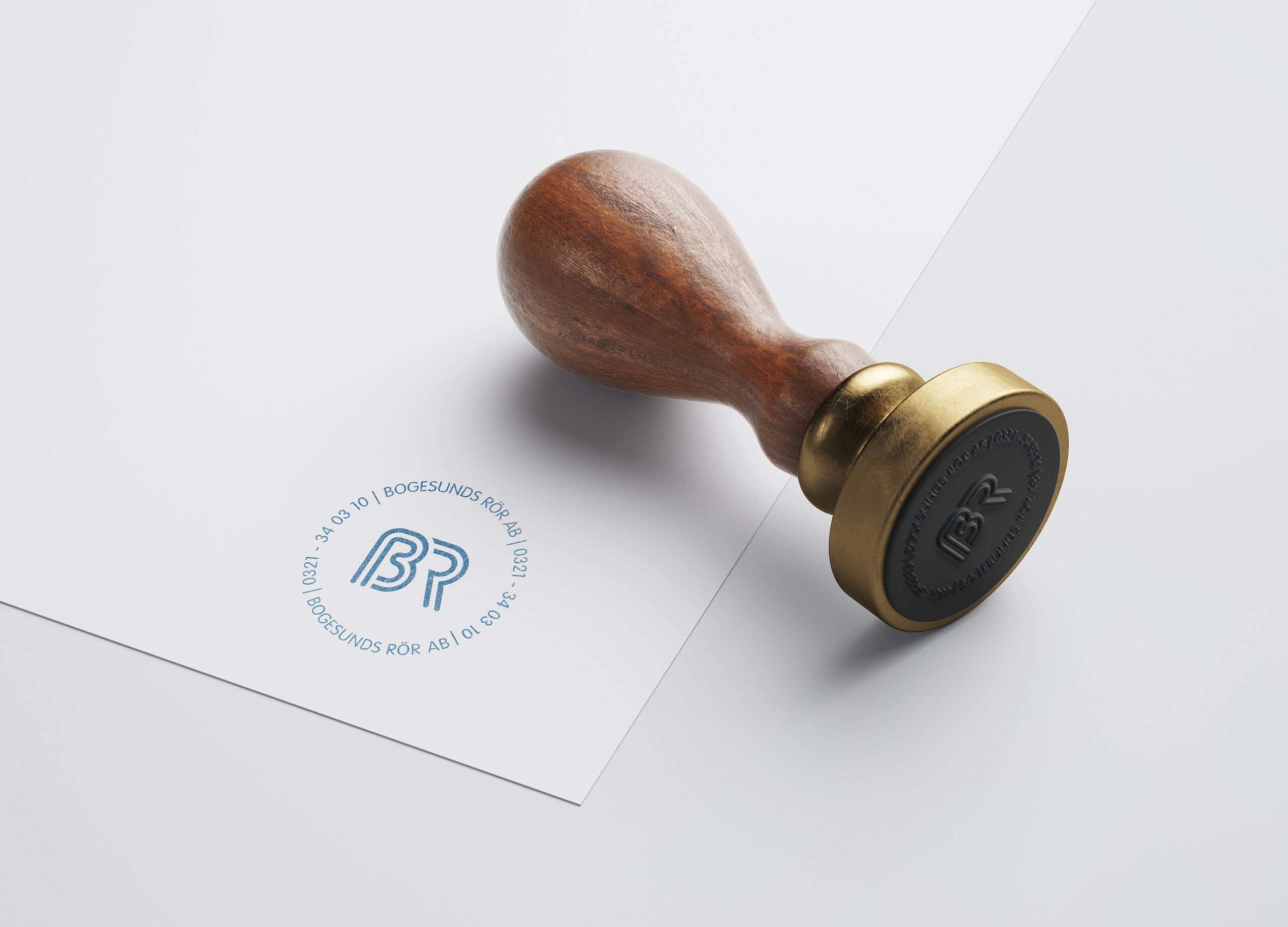
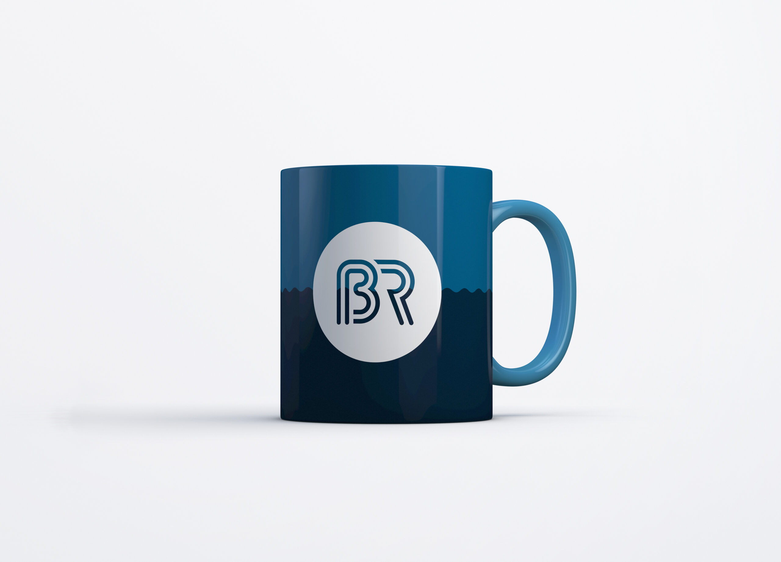
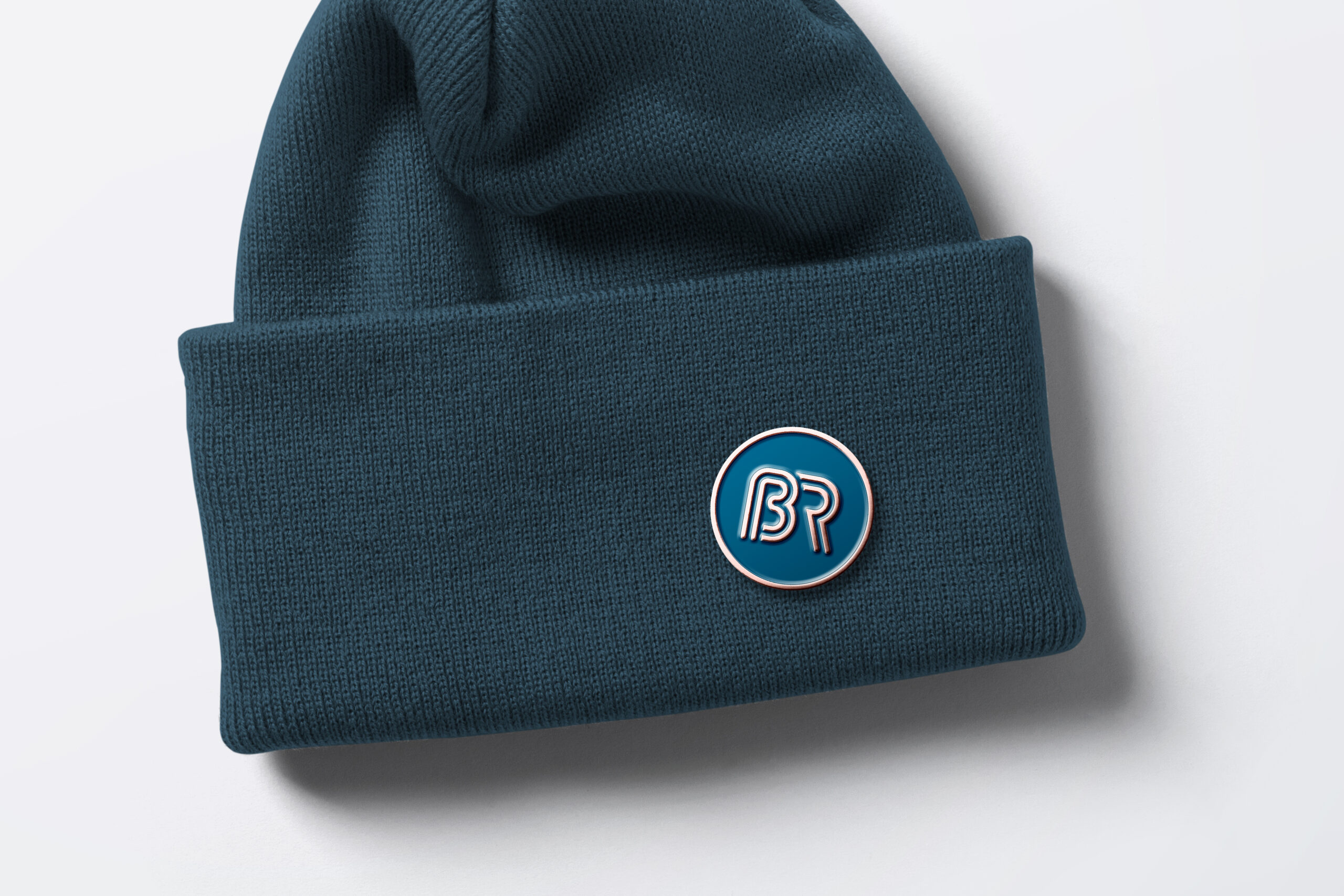
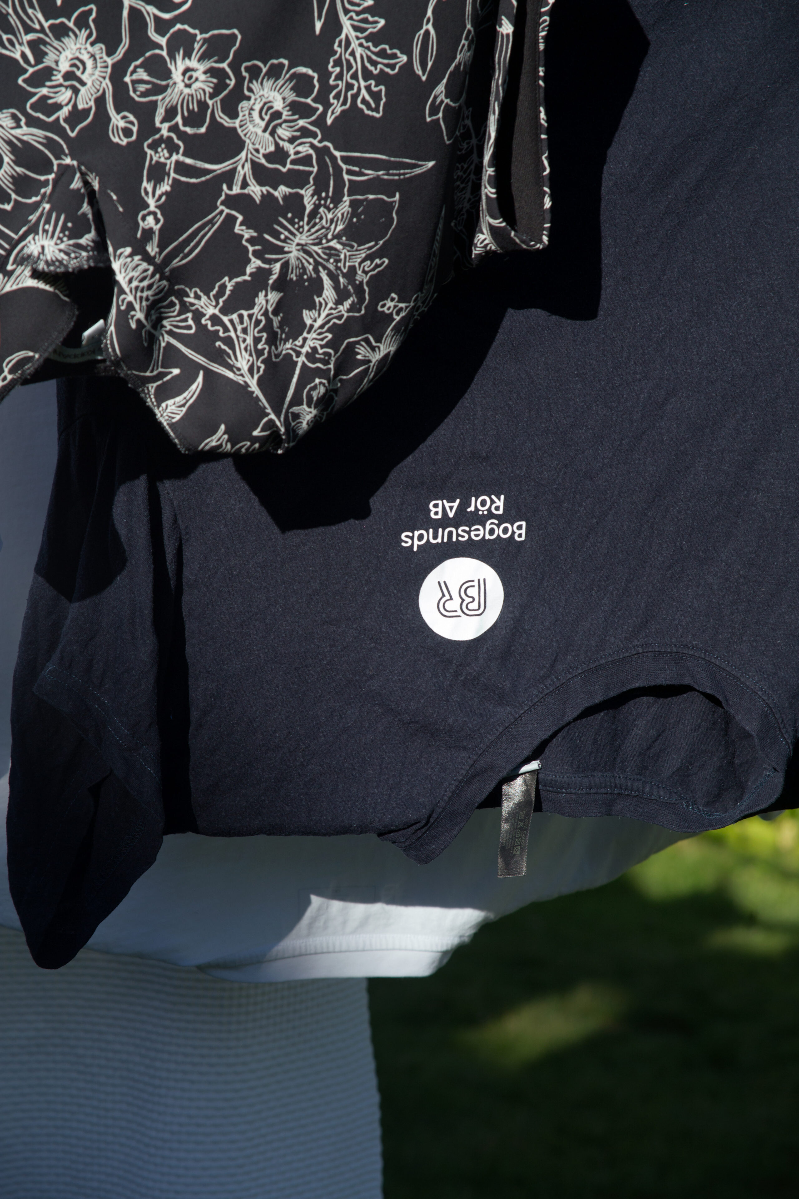
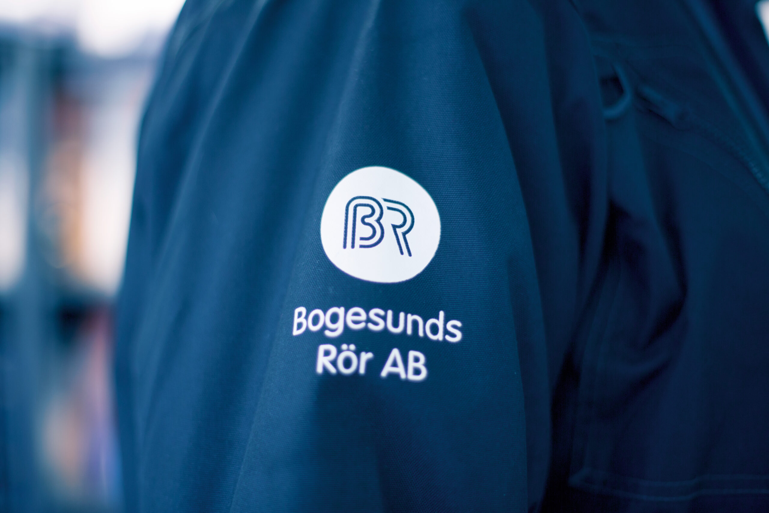
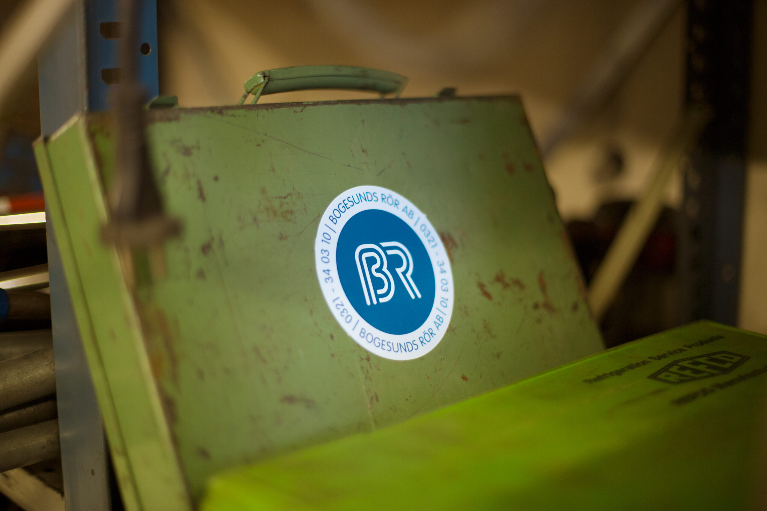
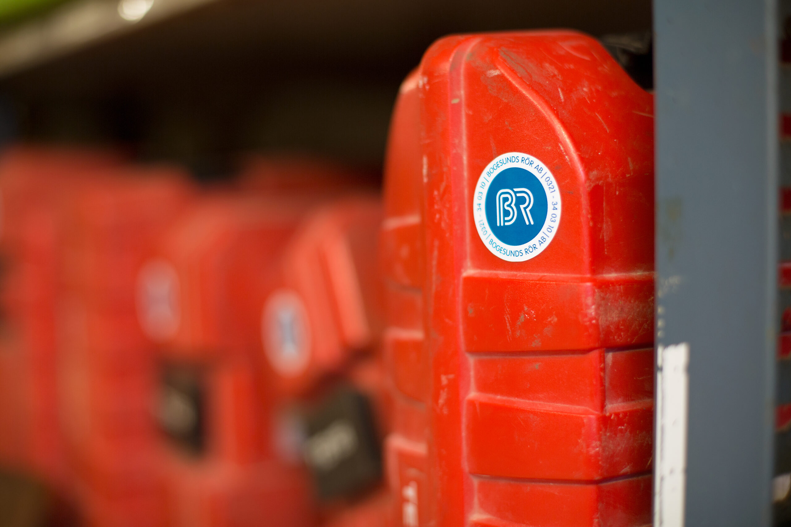
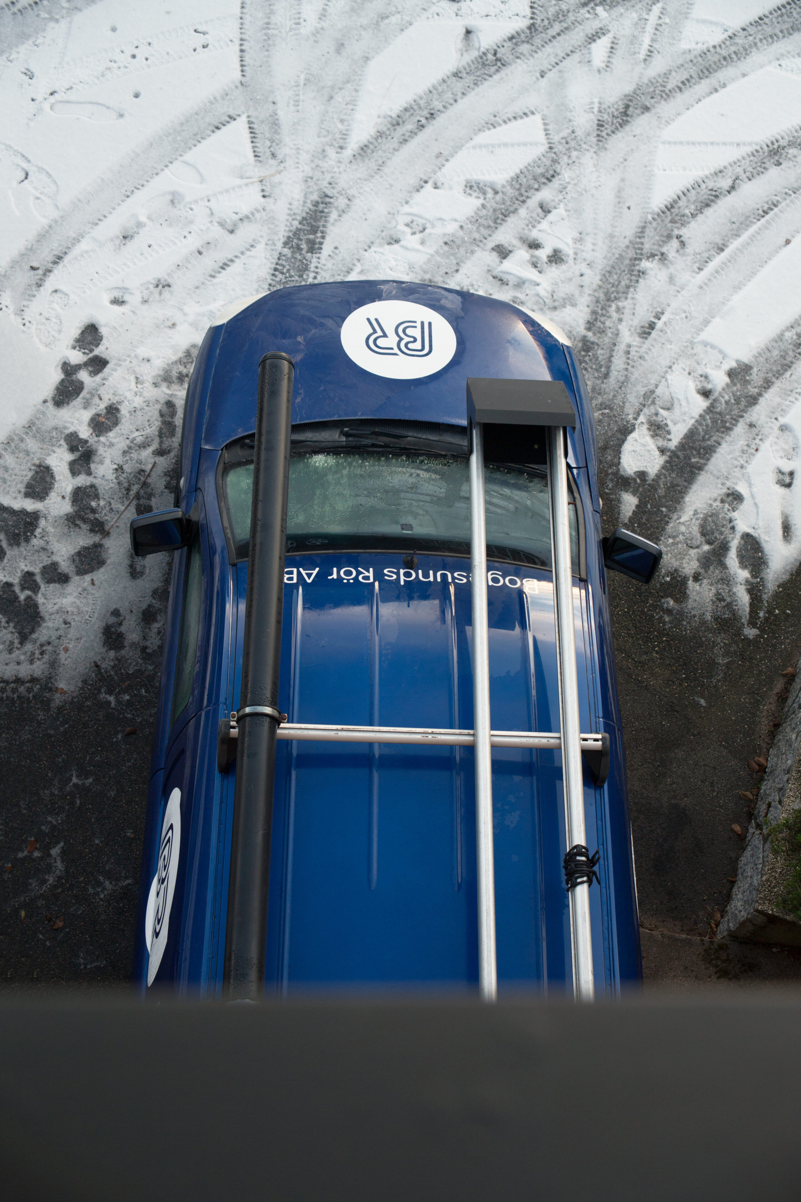
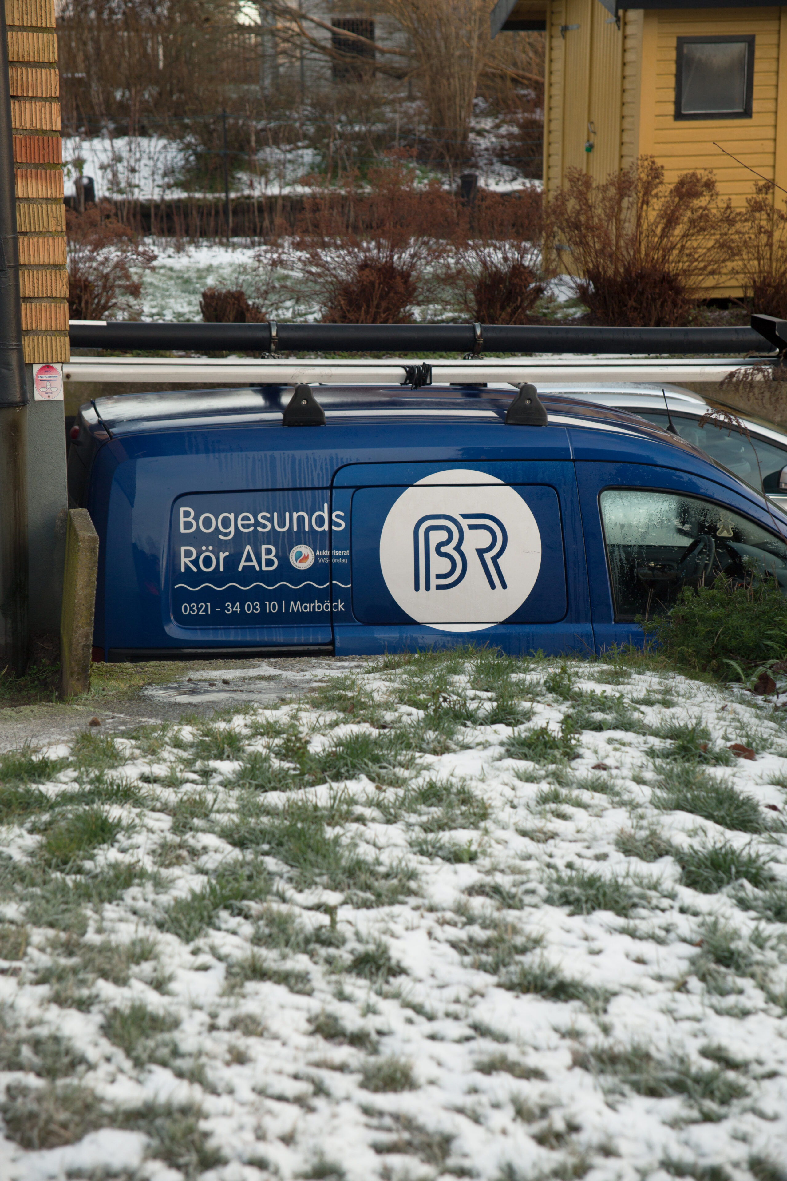
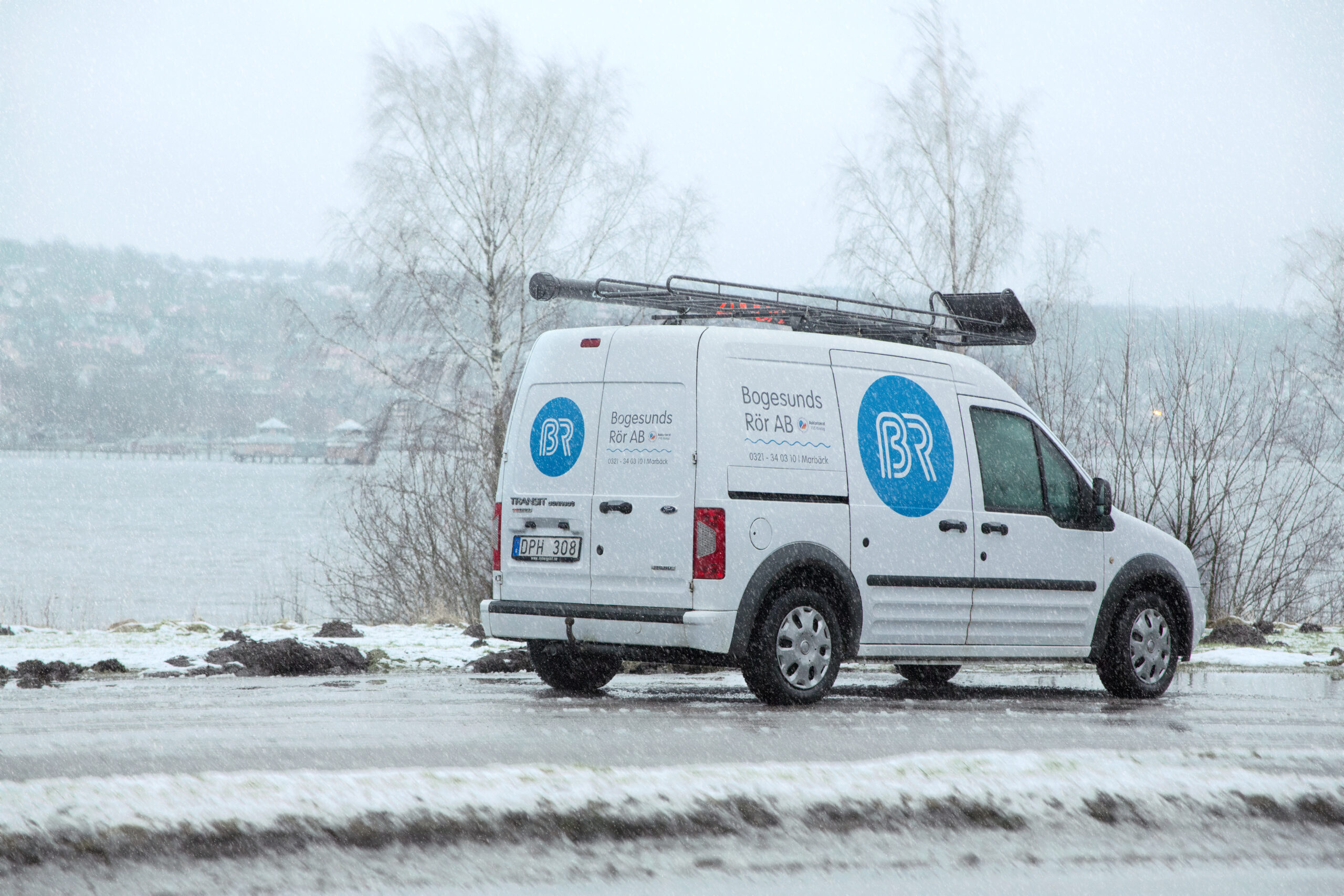
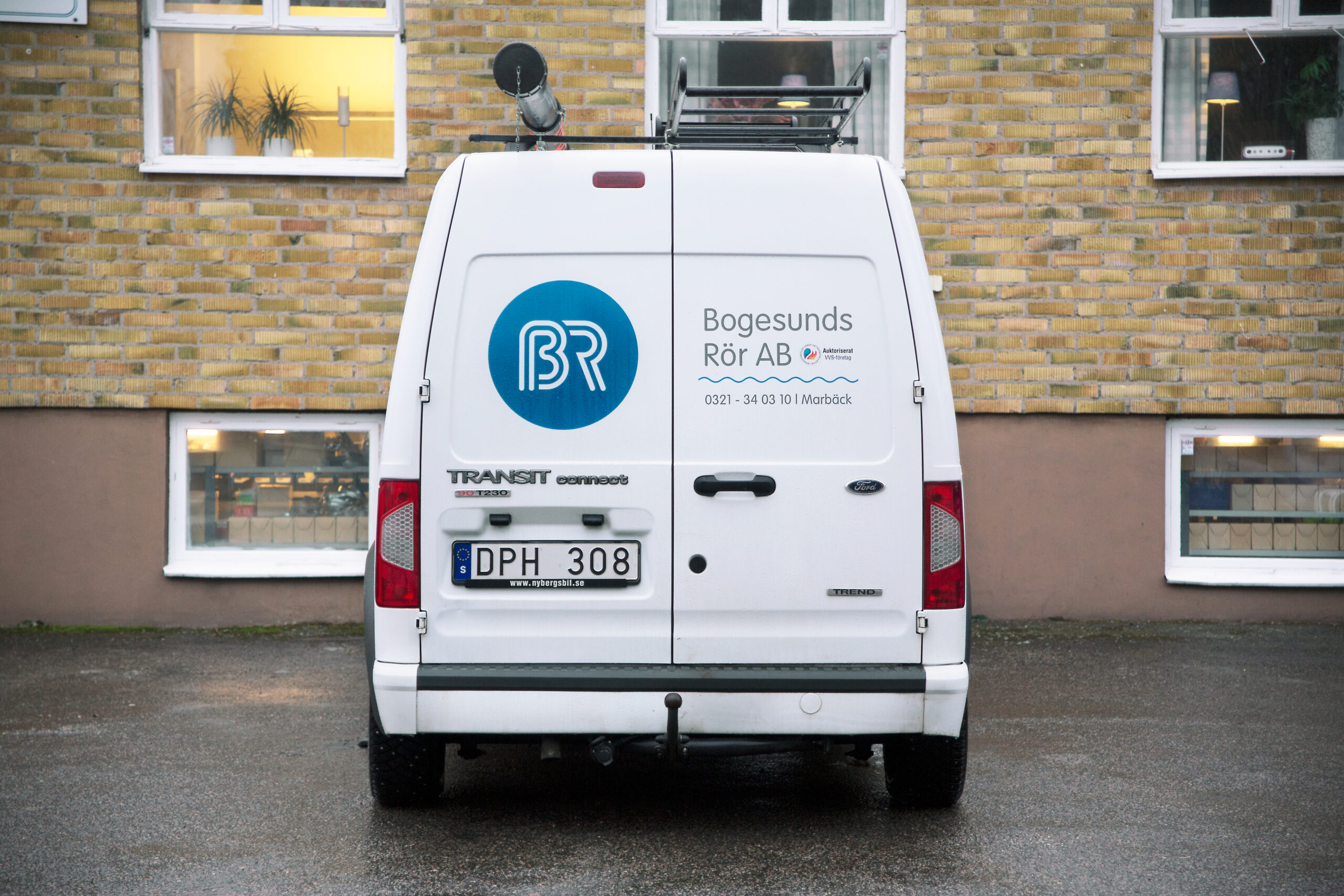
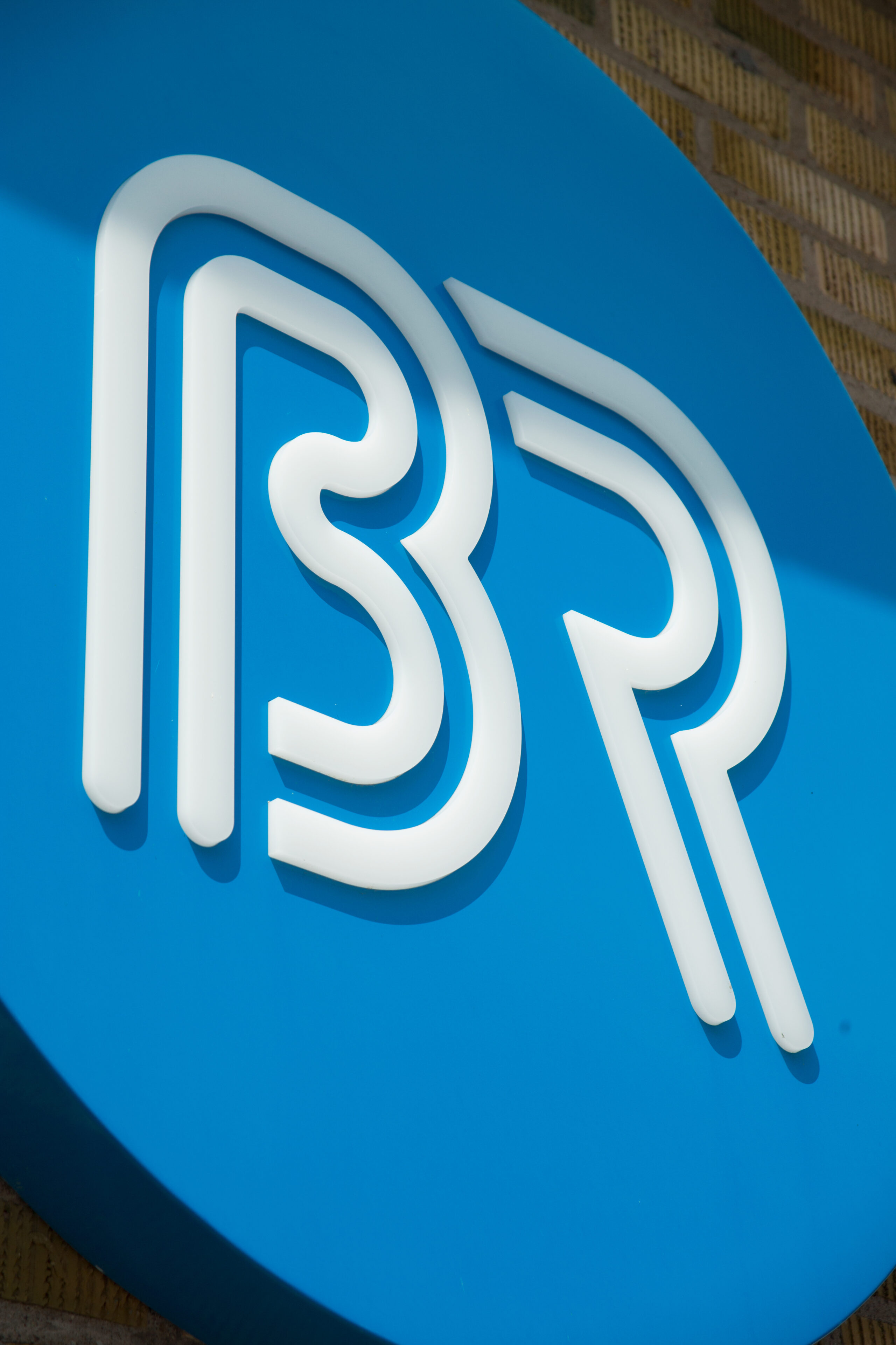
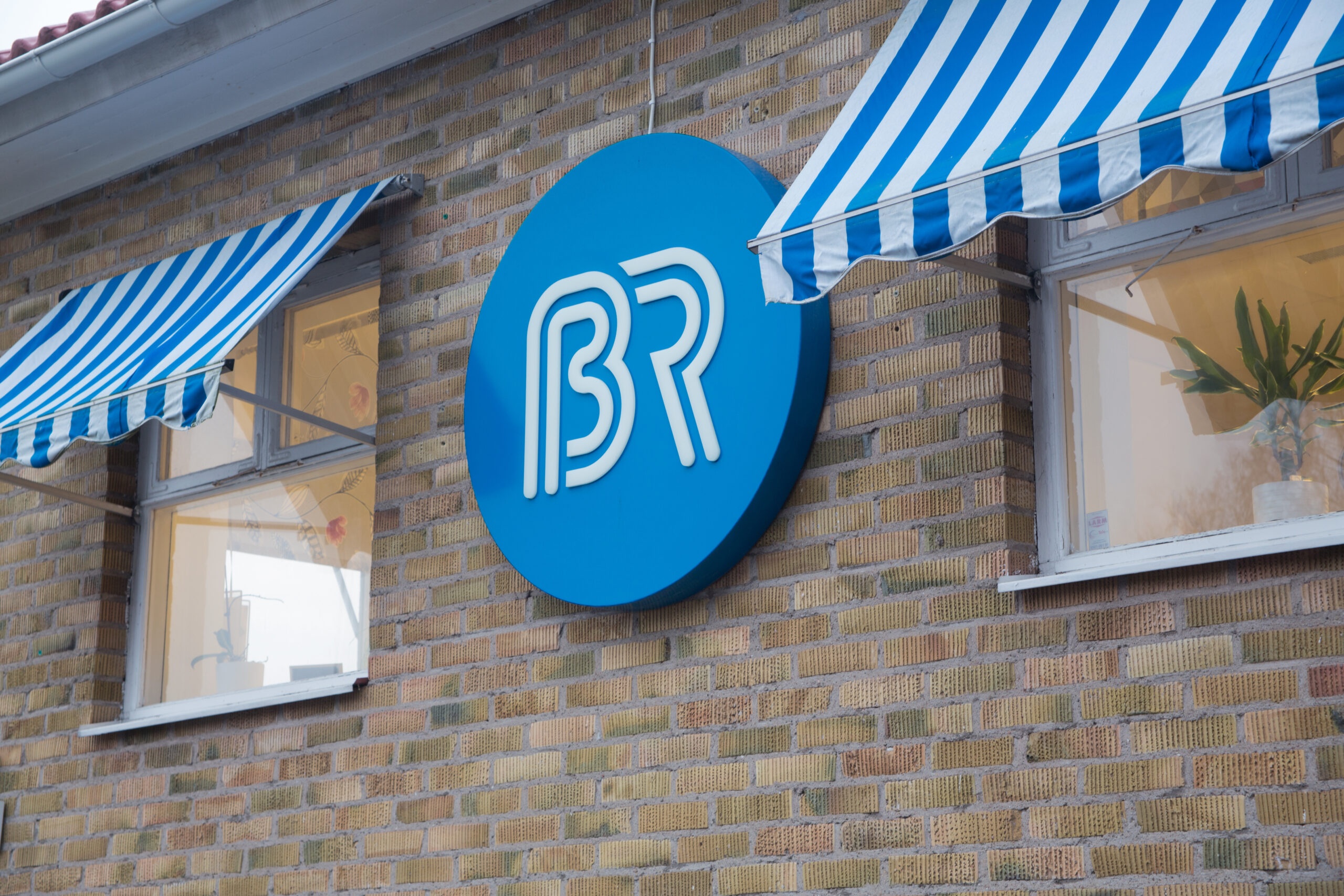
Working with the brand visual, the biggest challenge was to create a new logotype that still felt like the same company. Keeping the aesthetic shape-full style of the original hand made type, but making it softer and bolder. Simplifying the design by using a dynamic and more modular logotype consisting of a symbol accompanied by typography.
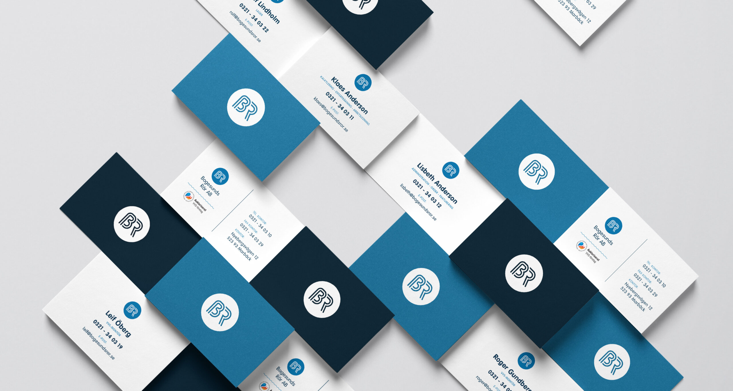
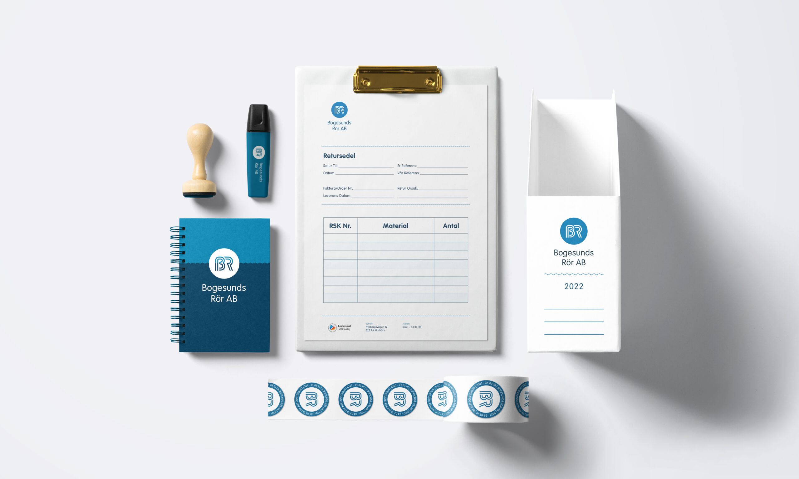
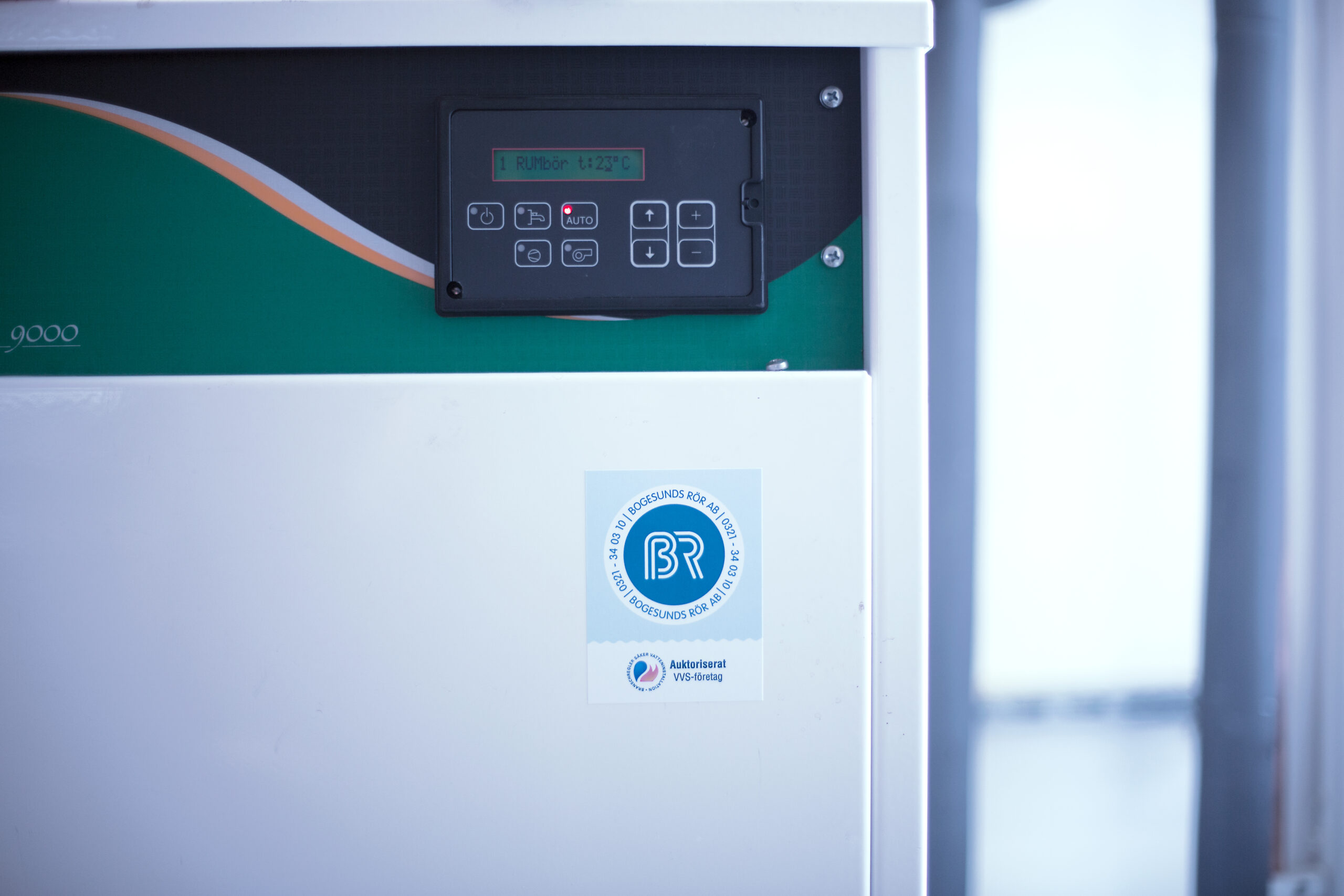
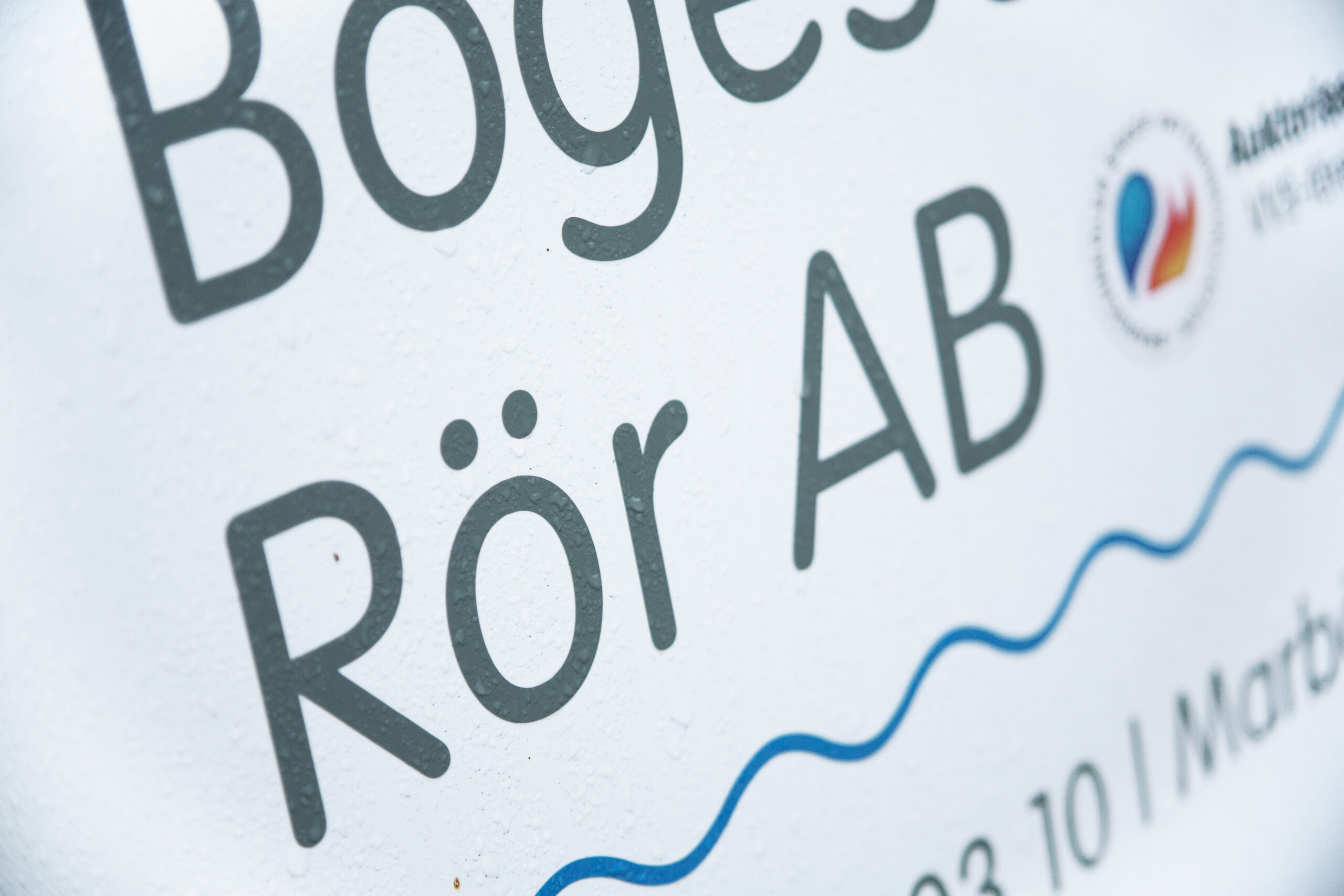
The original logotype was more of a label that included all communication in one design, the new edition is a responsive version that adapts to fit every size, shape and purpose. Separate the licensing symbol from the logotype, since this isn't part of the company but only used to legitimize the professionalism of the company.
The new main profile colour is also a bit brighter, embracing a neighbourhood feel. That of a small and friendly local company, operating on the country side where trust is personal and binding.
Client
Bogesunds Rör
Roles
- Art & Creative Direction
- Graphic Design
- Motion Design
- Photography
Outcome
Identity, Print & Advertisement.
Year
2001-2022
