Fidotext
Fidotext
—
Client
Translation company that helps businesses in the roam of Norwegian, English and German.
Problem
The original logotype was a DIY project by the creator of the company, it was a placeholder for the time and worked during a build up.
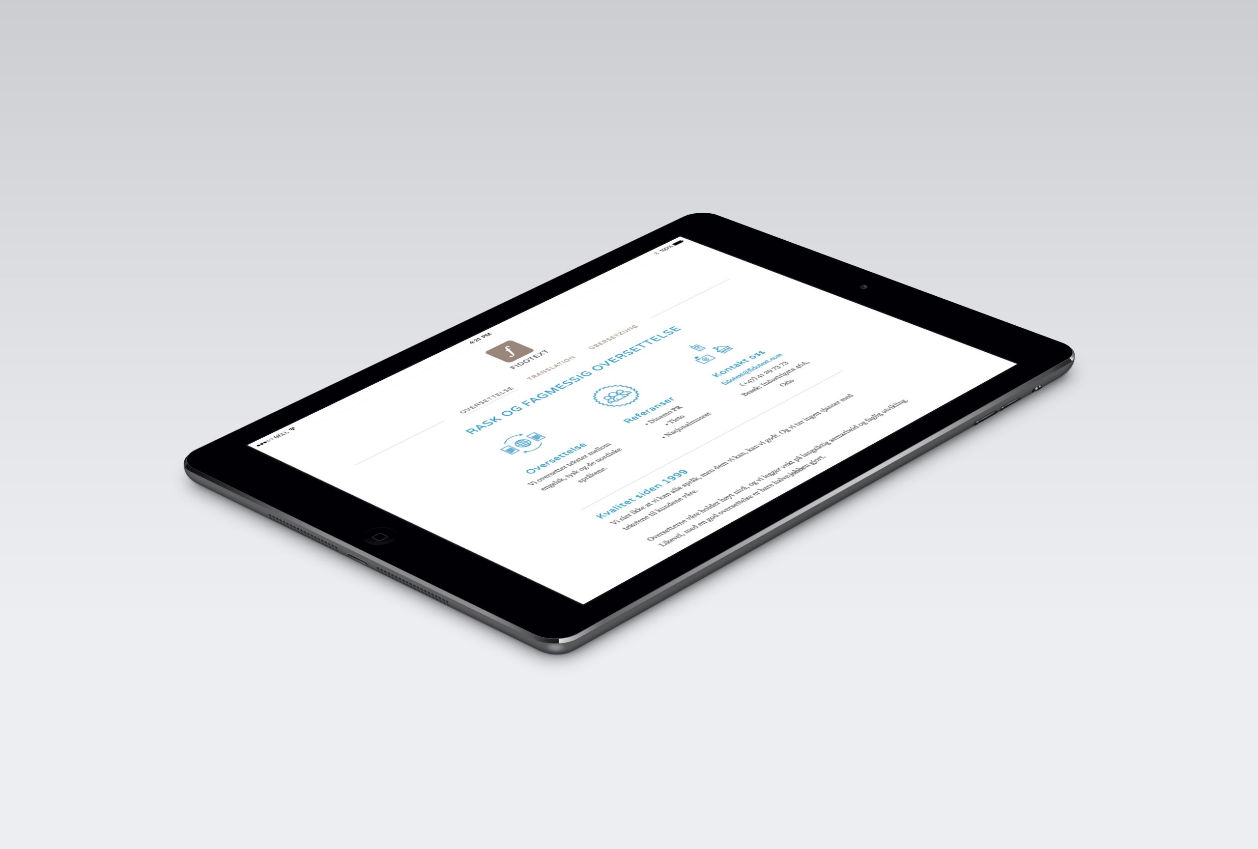
But in order to market the services online and gain trust in marketing, a rebranding and clean up of the old identity to a modern and digital friendly look needed to happen.
Solution
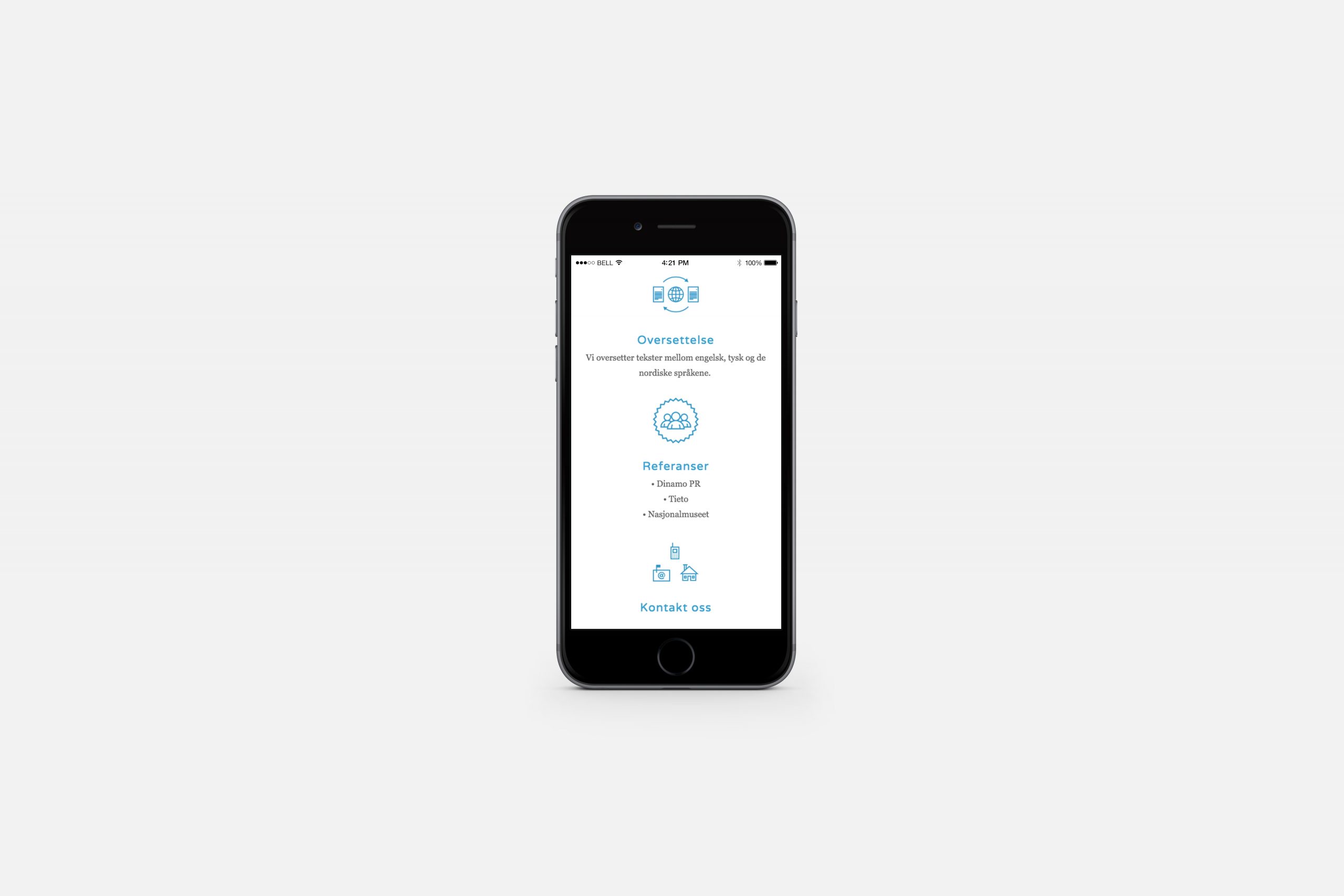
Friendly earth tone colours and figurative visual language for the identity, accompanied by customized icons for navigation.
Using a semiotic language as part of the branding seemed appropriate when working with linguistic focused business.
Agency
Majonajs
Client
Fidotext
Roles
- Art Direction
- Graphic Design
- Web Design with Torstein Norendal
Outcome
Identity, Custom Icons & Website.
Year
2013

