The Grind
The Grind
—
Client
The Grind is the invention of Munnfull Mat, a company which aims to deliver an extravagant food experience for people on the go. Simplifying all aspects, from cooking to delivery and focus on making the most out of the least. Handpicked meat, grinded to mince by the chefs themselves makes the foundation of this homemade cooking style street food concept.
Problem
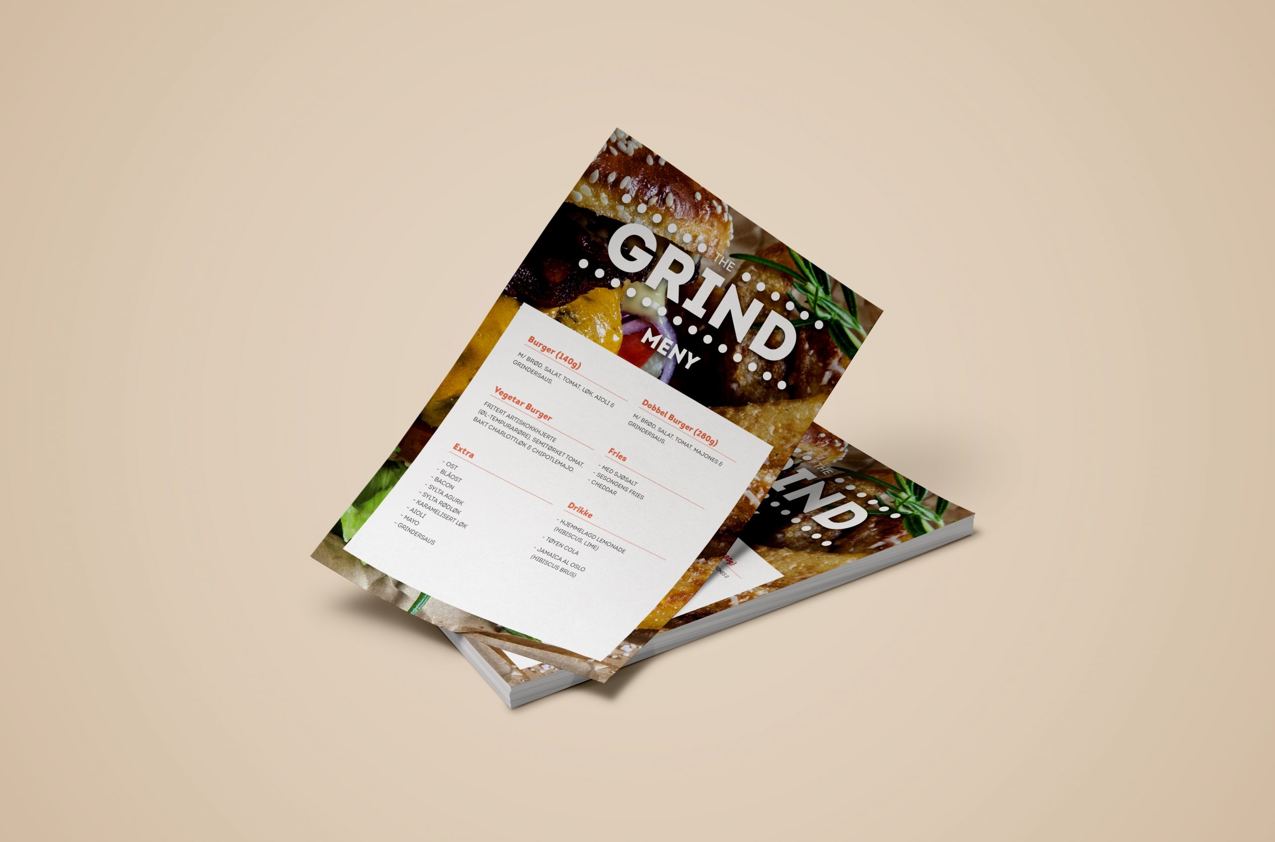
As a startup, they were in need of a full visual identity. A concept to help advertise who they are and what they do, both in print and in physical applications.
Solution
The name has a double meaning and originates from both the physical preparation of the main ingredient, but could also be used to describe the target audience. “On the grind” is an urban term used to describe people who are working hard, in this case customers that have little time to spare but still want premium quality food.
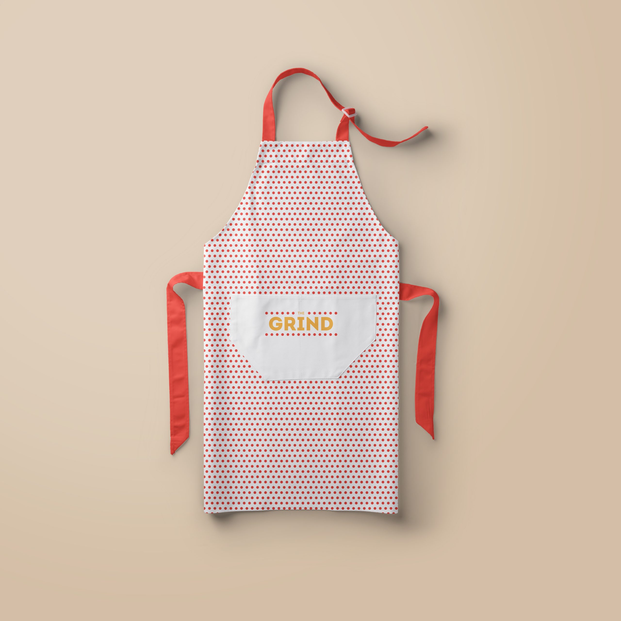
As with the food, a visual identity was created with a minimalistic approach. Keeping it simple and clean, with a touche of retro fast food aesthetics. The dotted pattern is inspired from the meat grinder, more specific; the exit. The colours are warm and strong, accompanied by a thick and strong sans serif font to communicate a solid and trustworthy product.
Agency
Majonajs
Client
The Grind
Roles
- Art Direction
- Design
Outcome
Identity, Print & Package.
Year
2015

